Spark.


This image proved a challenge. Exploring the origin of ideas and which ones stand out as having greater potential over others. Started with the barest glimmer of a sketch as a very loose framework - all in the sprit of the subject being explored. After digging around for some appropriate reference I started to render my own version of an old NGK spark plug in quite tight detail but also exaggerating and simplifying elements as needed - hence the obvious choice of Adobe Illustrator for this as it offers an immediacy and directness I sometimes find lacking in photoshop, brilliant though it is.

Originally there were six versions of the image, narrowing down to these three 'finished' pieces. Two exploring the human link by using a figure base, as per the original sketch; the third taking it into another direction by putting the plug in a landscape with other 'dead' ideas. Taking it over into photoshop allowed some of the painted textures to be added and integrated with the plug. A similar green / brown pallet was used throughout. In the end I re-work the winged version, altering the tonal balance to make it a little warmer. A digital glaze perhaps? This is probably the most successful of the three, but I kind of like the slight ambiguity of the other two.

When working in this way its good not to have all the answers. Taking risks as I went along meant the old cliche of the 'happy' accident comes into play and allows for unexpected results. The unfortunate point being that you have to work through all of the poor variations to move forward. Just like when generating ideas, some creative happy accidents are worth embracing and can be used in future images, others go to the creative graveyard and become the ghosts failures past!

Bomb!


To anyone tuning in - a belated happy New Year! Its been a little busy here with one thing and another so no time for blog entries - woeful I know! I've just restarted a couple of experimental pieces that were lurking away in the background, finally making a concerted effort to get them finished. I played around quite a lot with colour on this illustration. It still amazes me how much the effect of colour and specifically the tone of colour has on the atmosphere of an image. I preferred the green and the orange versions and opted to push the orange one to finished artwork. The theme is based on a lighthearted article I found on 'military paranoia' where the patients in question have no reason to be afraid, but still have an irrational fear of military persecution! As this is an experimental image it may get some tweaking to push it further.

Radio Times Christmas livery pages.


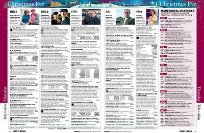
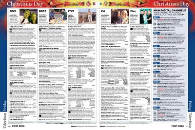
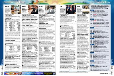
Above are close ups to show detail and how much bleed area was rendered. Below show the illustrations in situ...


The Christmas Edition of the Radio Times is just hitting the news stands around now. Along with a couple of other artists I was invited to submit sketches for the Christmas Eve page livery. Numerous pencil drawings and a 'finished' colour rough test piece were submitted and I'm delighted to say that I got the job to illustrate the rest: Christmas Day, Boxing Day, New Years Eve, New Years Day and Radio In Your Area spreads. The space for the artwork is pretty limited - approximately a 17mm deep strip across the top of the double page spread. The illustration has to accommodate text and of course the central gutter. The first temptation is to ram the design with as much content as possible, using the top and bottom edges to frame and crop objects close up and run content down either side strip, but this years brief requested a clean simple set of images with just one theme for each, but still using traditional iconography and keeping the side colour more or less intact for simpler 'colour day page' magazine navigation. It took quite a few roughs to get the designs and ideas simple enough to work as a set. The deadline was fairly tight with around a week to take all the images to print once the sketches were approved. A few late nights with the odd necessary correction where needed and the job was done! Following the line work, the finished images were rendered mainly on the Mac with some acrylic painting here and there. I'm really pleased with the set and if I had to pick a favorite it would probably be New Years Day. I always really like Radio Times commissions as the projects are fun to do and they are lovely people to work with as well, which is a definite bonus.

Christmas Cards.


At long last I've finally created some of my own Christmas cards, something I've never got around to doing before. A couple of playful ideas to be used on cards for personal use, not a client mailer or anything on that scale - that said a few clients may get one in the post! Somehow I've never done a Christmas 'work' mailer as yet, despite the obvious promotional opportunity with all of those cards crossing the globe to their respective personal and commercial destinations. Will do one at some point!

The images were done pretty quickly using elements of recent work. The 'ghosts of illustrations past' as it were! We three kings (robin X 3) is a play on the three wise men, combined with a reference to a set of decorative wall mounted ceramic ducks from a childhood memory of them being on an aunts wall. Space baubles X2, one with a background and one without - these B movie references will just not go away.!!! I also wanted to try out a new printer who I've not used before (Moo clicky). A very user friendly site, but limited scope to play with the overall card design. Will report back on the quality when they thud onto the doorstep.

New Scientist: Black Holes & Dark Matter


Sometimes commissions come along where the boundary between work and play gets a little blurred, this was one such project for the New Scientist. A cracking article to illustrate that explores theoretical space travel, where spaceships are powered by black holes and dark matter! After a few emails the Art Editor and I decided on the approach of William Heath Robinson meets a 50's B movie...! Image was rendered as above but was flipped for printing. A joy from start to finish. Out on the news stands right now.